By way of reminder, that study - and the timing of the self-reported symptom curves in the seropositive participants - is often cited in support of the core narrative of the 2019 emergence and global 2020 spread of a novel virus named SARS-CoV-2.
In that analysis, we said we’d contacted the authors to request details about their curve-construction methods and symptom data for antibody-negative participants, and that we would update the piece if they provided a response that addressed our questions.
In July, Jonathan reported (here) that we hadn’t heard back from the authors, despite sending a chaser, and eventually sent the following complaint to the Dean of the Faculty of Medicine:
From: Jonathan Engler
Sent: 09 July 2025 11:24
To: s.pigott@imperial.ac.uk <s.pigott@imperial.ac.uk>
Subject: Re: Query related to REACT-2 paper
I am addressing this to the suggested contact for the Dean of the Faculty of Medicine at Imperial.
The below is self-explanatory. I have received no response.
Is there any way in which you can prompt the authors for a response?
It’s worth noting that:
The data is of huge value in assessing the REACT study
The authors I emailed are listed specifically as authors for correspondence
They are employed by a public - not private - institution
The study itself was taxpayer-funded (by DHSC)
I do not find it acceptable that my email - asking for information which was quite clearly collected but has never been made public - is simply ignored.
Is there a body within Imperial to which I can lodge a formal complaint?
Regards
Dr Jonathan Engler
MB ChB
That finally prompted the following response from Matthew Whitaker, one of the authors on the study:
Dear Dr Engler,
To construct the epidemic curve we used the responses from pages 4–6 of the REACT-2 round 5 user survey (https://www.imperial.ac.uk/media/imperial-college/institute-of-global-health-innovation/210114-Study-5-ANTIBODY-Round-5-User-Survey.pdf) – specifically the COVIDSTA variable to get reported dates of suspected infection. These were filtered to IgG antibody-positive respondents only using the results of the LFT, as reported by the respondent.
I have run off the raw numbers for self-reported infections by week from REACT-2 round 5 and you can reconstruct a version of the curve plot from it (without the rolling window component). The plot would have been constructed in R.
I attach a spreadsheet with various sets of raw numbers per your request:
sheet 1: breakdown of COVID-related symptoms reported, comparing IgG positive vs negative respondents.
sheet 2: sum of people reporting onset of COVID symptoms (COVIDSTA) by week, comparing IgG positive vs negative respondents.
sheet 3: sum of people reporting onset of COVID symptoms (COVIDSTA) by week, among unvaccinated respondents only, comparing IgG positive vs negative respondents.
sheet 4: cross tab of people reporting any (one or more) symptoms that they thought were COVID-related, by IgG status.
Please note that any numbers <10 have to be censored for identifiability reasons. This results in a few blank cells in sheets 2 and 3.
For access to the individual-level data, you can make a data access request here:
After reviewing the response and corresponding data, we have further comments and questions.
Some of our concerns relate to the potential for bias resulting from self-selection:
The methods section of the abstract reads as follows:
A cross-sectional community survey in England undertaken between 26 January and 8 February 2021 as the fifth round of the REal-time Assessment of Community Transmission-2 (REACT-2) programme. Participants completed questionnaires, including demographic details and clinical and COVID-19 vaccination histories, and self-administered a lateral flow immunoassay (LFIA) test to detect IgG against SARS-CoV-2 spike protein. There were sufficient numbers of participants to analyse antibody positivity after 21 days from vaccination with the PfizerBioNTech but not the AstraZeneca/Oxford vaccine which was introduced slightly later.
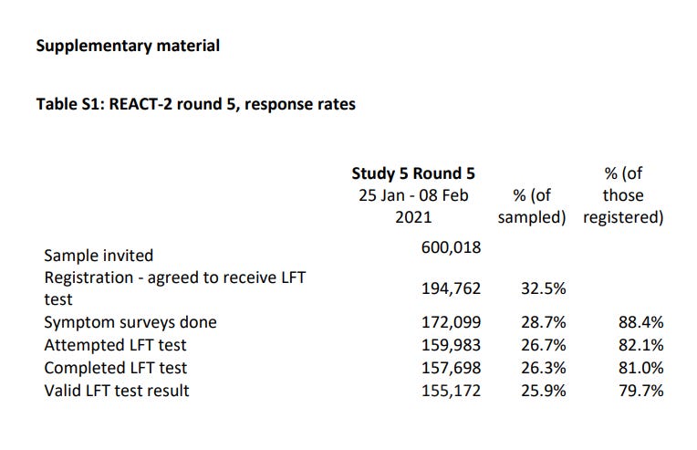
Here’s the table describing the numbers invited, participating and so on.
(Note that in this study, “LFT” refers to a fingerprick antibody test, not an antigen covid test performed from a nasopharyngeal swab, which also became known as LFTs following their introduction in April 2021.)
The 600,018 invited were selected at random from an NHS database. That seems reasonable. But the ~200k respondents who agreed to receive an LFT test were entirely self-selected, which biases the sample strongly towards those who “believe in covid” and want to know if they “had it”. Given when this took place, in early 2021, it’s unlikely that many of the respondents would have been sceptical of the government narrative.
Following that, the sample size decreased at each stage, as can be expected with any survey-based study:
Some people dropped out by not accessing and completing the survey online, perhaps upon learning that a finger prick was needed
Of those who remained, some completed the survey but did not attempt the test
Another cohort attempted to take the test but did not complete it successfully
Finally, some of the tests failed to return a valid result.
To reiterate, each of the above stages - except the last one, possibly - could well be enriching the final sample of ~155k with highly-motivated respondents who, at that point, accepted the government’s narrative about a new and unique illness, had experienced symptoms they were told could be signs thereof, and wanted to know if they’d already ‘had it’.
Such “believers” are, of course, highly likely to consider - when being asked about their symptoms (indistinguishable from colds and flu) up to a year prior - that their illness must have dated from spring 2020 or earlier.
Moreover, the paper states this:
Those who registered were sent a test kit, including a self-administered point-of-care LFIA test and instructions by post, with link to an on-line instruction video. Participants completed a short registration questionnaire (online/telephone) and a further survey upon completion of their self-test, including information on demographics, household composition, symptoms, and history of COVID-19; participants also uploaded a photograph of the result.
So the respondents apparently knew their test result when completing the survey on symptoms and covid history. This would appear to be a major source of bias - both in terms of the propensity to bother continuing with participation, but also in respect of the symptoms being reported and attempting to pinpoint the dates thereof.
Additional issues with this paper are as reflected in the further email (below) we have sent the authors. The most egregious of these - in our view - are:
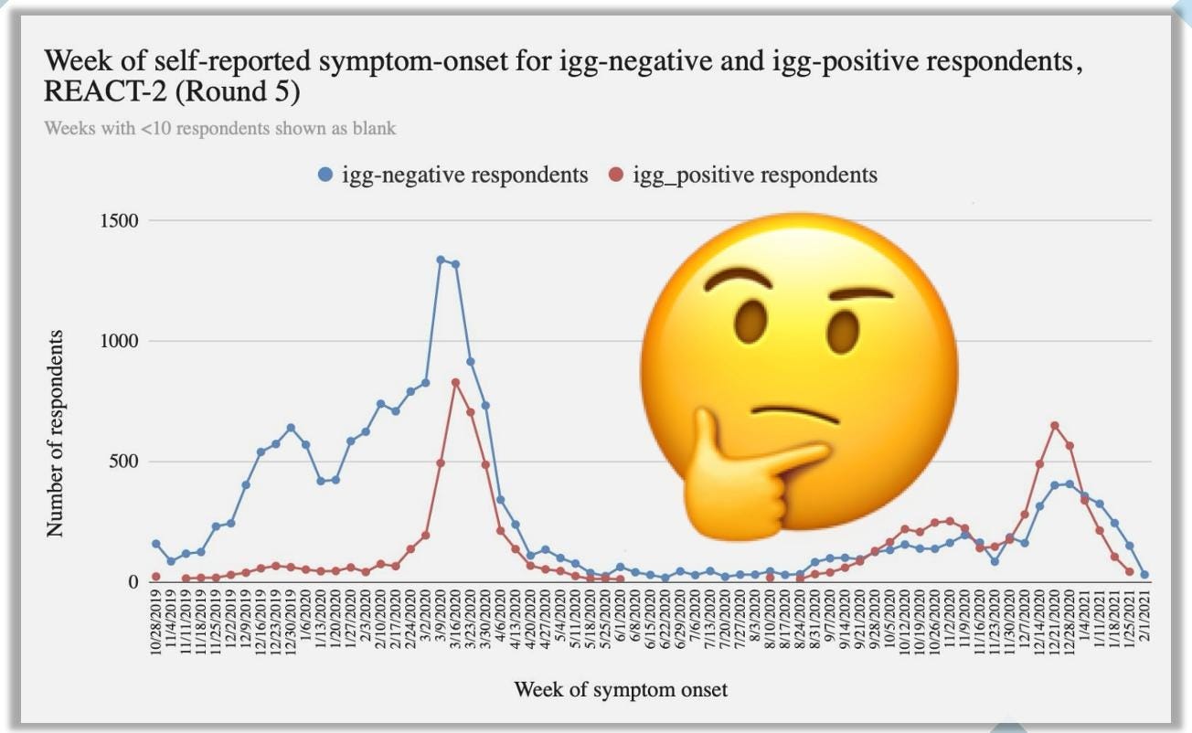
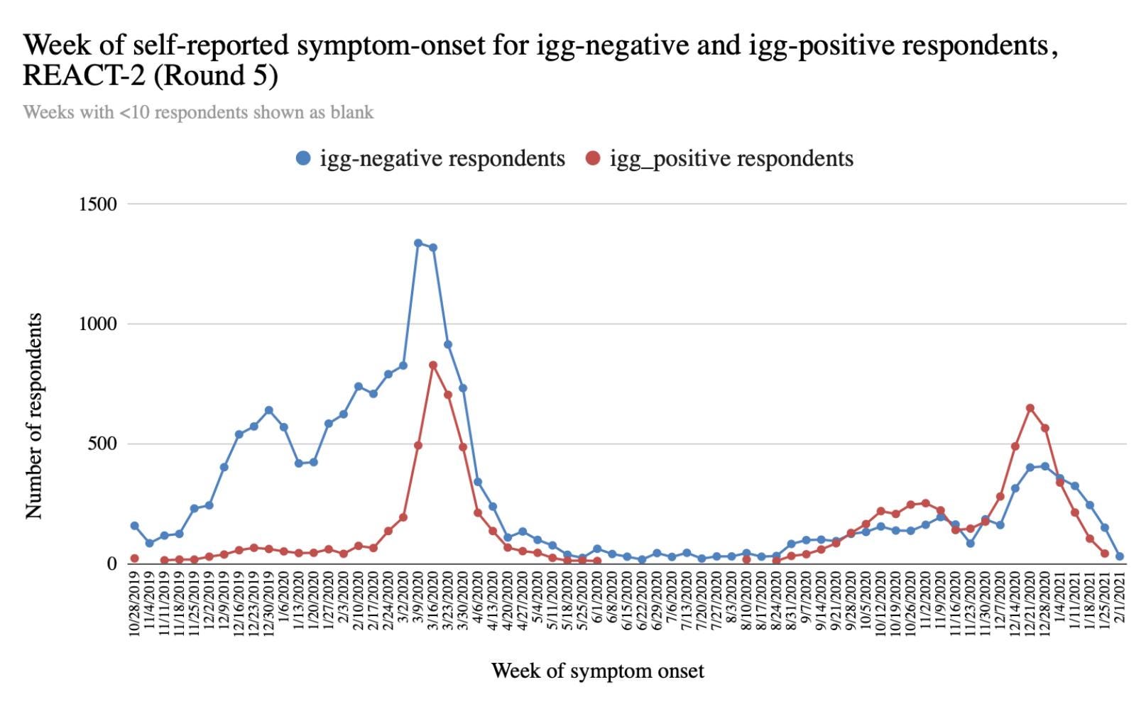
Despite having the data, the symptom data from the seronegative subjects was not provided in the original paper. When plotted, it puts the graph of the seropositive subjects (in figure 1 of the paper) in a rather different light (as set out in our follow-up email below).
The symptom data of those who did NOT think they had had covid is also unpublished, yet this could well shed light on the relative uniqueness (or mundanity) of the experience of those who thought they had “had covid”.
It is important to recognise that because of the global influence of modeling, the UK was one of - if not the - intellectual nerve centre of the covid operation, and Imperial was the most important institution in this regard. Moreover, Imperial’s “pandemic” research was funded in large part by the British tax-payer.
The REACT series of studies has been regularly cited internationally to justify core elements of the pandemic narrative, most notably the concept of “herd immunity”. For these reasons, it is entirely reasonable that they be held to the highest standards in terms of transparency, ethics, and science.
Hence we feel justified in asking further questions of this team, and have sent the following email to Matthew Whitaker:
Matt,
Thank you for your response to my questions.
A few additional (admittedly rather belated) questions / clarification if I may:
In your spreadsheet, covid_Sx_tab, am I correct in assuming that you have ignored the likelihood that those who answered yes to question 32 (“none of those”) probably belong in the COVIDC = 1 cohort (ie, there’s a logical design error here)? This is because if they’d had any symptoms not fitting into 1 - 30, they could have just ticked 31 (other). It’s only 208 subjects, and therefore numerically immaterial, but thought I’d ask. I note you’ve included them in for the total for covidsym_ANY.
Re the figure 1 (your reconstructed epidemic curve), I think you are saying that only subjects with symptoms are included (as COVIDSTA isn’t asked if COVIDC = 1). But can you confirm that if subjects answered 4 to COVIDA (bottom of page 4) they aren’t included in the reconstructed epidemic curve (ie those subjects who did NOT think they had had covid but then test positive for antibodies)? Moreover in respect of these subjects I don’t believe we have a breakdown by serology result - ie how many of those who answered 4 to COVIDA were seronegative, and how many seropositive. Could that be provided, please?
Regarding the COVIDA = 4 subjects (those who did not think they had had covid), I note that they were asked (page 11) about their symptoms, and asked for the month in which these symptoms occurred. Please could we see that data (broken down by serology result). Is there a reason why these subjects were asked for a specific month but those who thought they had had covid were asked to recall a specific day?
We note that figure 1 in your paper depicts 7 day-rolling data (per label), But tab 2 of your spreadsheet only contains weekly data. I am presuming that the dates there are the Mondays of the week in which they reported their date of symptom onset. Is that what is meant by a 7 day rolling average? Can you clarify how the 7-day rolling average was calculated. Regardless, we would like to see the daily data please.
There are approximately 17k subjects who completed the questionnaire but returned no antibody data. Please could we have the symptom data for those?
When we graph the symptom dates for the antibody negative subjects, we obtained a similar curve to the positive ones in terms of timing.
Generally, commentators have made much of the fact that the recalled symptom dates in antibody-positive subjects coincided with the timing of covid “waves”.
However, the curve in the antibody-negative subjects (the closest thing to a control we have here) appears to be similar in shape. This suggests the pattern observed is not unique to those who tested positive and is not distinguishable from patterns of influenza-like illness in the autumn and winter months.
Was the inclusion of a graph for such negative subjects ever considered?
Thank you so much for taking the time to address the above questions and requests.
Regards
Jonathan Engler
We will update readers when we receive a response.
Thanks for reading Sanity Unleashed! Subscribe for free to receive new posts and support my work.
First class, thanks - I am surprised he ever wrote back but glad he did. The "doing wrong to do right ( in their opinion) crowd" are never inclined to reveal the " wrong".


First class, thanks - I am surprised he ever wrote back but glad he did. The "doing wrong to do right ( in their opinion) crowd" are never inclined to reveal the " wrong".
As always, the devil is in the details. It's so easy for them to deceive. Thank you for delving into the details for us!