
Fudging significance
What over a million confidence intervals tell us about scientific integrity

The other day I published a simple piece which consisted of quotes from four former editors of the top scientific journals.

I think it’s worthwhile continuing to look at journals, since it is clear to me that huge swathes of the population, including scientists and doctors, don’t realise quite how bad things are.
Firstly, I want to say a few words on publication bias - the phenomenon whereby those with vested interests (and control over publication) rig the system so as to make research which yields results favourable to their interests more likely to be published, while suppressing the publication of work which has outcomes they don’t like.
I have already written a few pieces on this:
In this, I describe a 2008 paper which analysed the publication history of all the trials submitted to the FDA in connection with 12 anti-depressants.
The results were startling:
97% of the studies FDA viewed as positive were published.
Of the studies FDA viewed as negative or questionable, ~60% weren’t published at all, and 30% actually conveyed a positive outcome. Less than 10% were published in a way which conveyed the Regulator’s perspective.
In the essay below, I pointed out that Pfizer appears to have “forgotten” about a large cohort of >26,000 subjects in its mRNA influenza-vaccine trial (which did not have favourable results) while ensuring publication of the data from its younger cohort, which claims superiority over the “traditional flu-shot”, though as I point out here it’s utter nonsense. (This cohort remains unpublished, to my knowledge.)
It’s worth pointing out here that the phenomenon of publication bias is separate from, but acts in synergy with many other tactics which pharma use. Fixing publication bias won’t fix the problems if the science itself can’t be trusted.
Evidence of manipulated outcomes reporting.
The science reported in journals is often shoddy, but if it were just shoddy, that would be one thing.
However, what we actually observe is that clinical research is designed and analysed in ways which tilt the observed outcome in the direction favourable to those paying for it, as the below illustrates.
The other day I was reading a blog (here) on statistical methodology in clinical trials, and came across a link to a post on X which including the following striking graph:
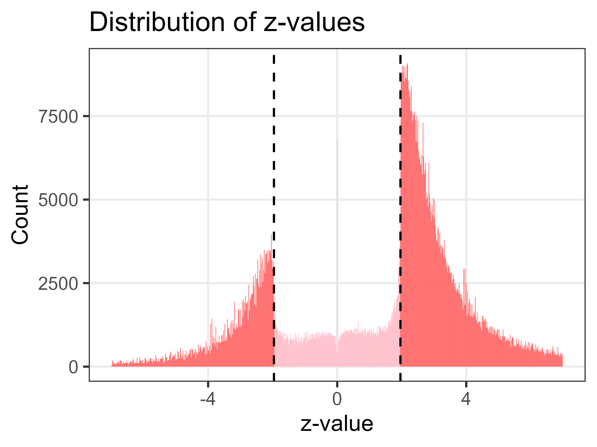
A “z-value” is the number of standard deviation from the norm. When something is described as statistically significant at the 5% level, this is 2 (1.98 to be precise) SDs from the norm. The vertical dotted lines in the above, therefore, equate to “statistically significant”.
Now, obviously, you would expect the distributions to be normally distributed, like the classic bell curve. What you would NOT expect are sharp, unnatural cut-offs at the points which mark the boundaries between significance at the 5% level, or not.
That graph was reproduced from this 2021 paper by two Dutch statisticians. The actual source of the data, however, as the authors pointed out, was this 2019 paper by Adrian Barnett and Jonathan D Wren from Queensland, Australia.
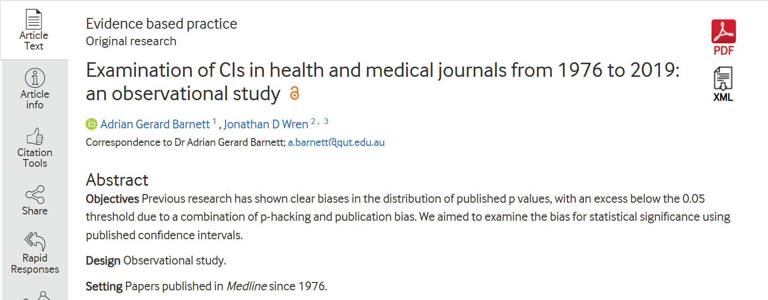

What Barnet and Wren did was this:
They created a text-mining algorithm to extract all the typical ways in which ratio estimates (eg, odds ratios, hazard ratios and risk ratios) and confidence intervals are reported.
They extracted over 968 000 intervals extracted from Medline abstracts from over 5900 journals, and over 350 000 intervals extracted from the full-text from over 2700 journals found by trawling Medline for all articles published since 1976.
They repeated the exercise for a set of published estimates derived from a large amount of data collected for insurance claims; crucially, these estimates were not subject to any ‘significance seeking’ by researchers or journals.
The results
“A clear and sudden change in the cumulative distribution of both lower and upper interval limits at the statistically significant threshold.
The discontinuity at 1 appears slightly stronger (less smooth) in the abstract than the full-text and there are noticeably more lower intervals below 1 in the full-text, which suggests that the biases are stronger in the abstract than the full-text.”
Further thoughts on these findings.
This is deeply unnatural. It raises several possibilities:
That publication bias is resulting in more results of significance being published
That the results are essentially manipulated to bring them inside the desired parameters
Clearly, from the comments under the original post on X, scientists are keener to focus in publication bias as the key reason, however that cannot explain the sharp, precision spike stacked immediately on the “right side” of the line. If journals simply selected for positive outcomes, you would see a smooth drop-off of non-significant studies, but the data that did get published would still follow natural probabilistic curves.
What this graph suggests - one could say proves - is active data manipulation, that is to say the active massage and forcing of non-significant numbers “across the finish line” before the paper is even submitted.
Bad as these might seem, bear in mind that the algorithm employed did not distinguish between primay and secondary endpoints - it just pulled out all estimates.
I have little doubt that due to the “special attention” being deployed on the primary measures, were it possible to focus on those the data would look even worse (for scientific integrity).
It should also be noted that many (most, in all likelihood) doctors only read the abstract to any journal articles, and the manipulation was worse for results contained there than in the full text.
Finally, it should be remembered that published trials are the “ingredients” of the systematic reviews and meta-analyses which form the bedrock of clinical decison-making and policy recommendations.
If these can’t be trusted, then nor can anything downstream of them.
In the words of Drummond Rennie (deputy editor NEJM 1977 to 1981, and JAMA 1983 to 2013) from a piece he wrote for Journal of Law and Policy in 2008:
Over the past thirty years, we have come to realize that the scientific record may be fabricated and in other ways fraudulent.
But having set up systems to deal with research misconduct, we are now discovering a vastly more important problem: the massive bias and distortion of the published evidence by researchers and their sponsors, both influenced by money.
Although likely not at all novel, my pea-brain tends to picture these types of manipulative research practices as someone throwing their darts at a blank wall, then going over and painting a target on said wall. Always making sure the target itself is big enough that all the darts end up in the bullseye. It is nothing short of stunning how many ways there are to manipulate studies!
I was at a lecture thirty-five or so years ago by the brilliant Dan Murphy. I recall him discussing a study showing that sugar did not cause hyperactivity in children. How did they pull it off? The authors gave the control group an amount of sugar that was off the charts by anyone's measure. Then gave the experimental group of children forty or fifty percent more.
Walla...... No difference between the groups.
Makes for great headlines ----- as long as no one looks at the study. This lecture took place in the era prior to the WWW, when looking at studies was a nightmare unto itself (travel to a university, microfiche, microfilm, card catalogs, 'the stacks', or waiting while the librarian unearthed said journal from the Federal Vault).
Anyone who has ever climbed the dodgy ladder that is academia knows the pressure to produce positive findings in order to get more research funding. As a health economist, I was told once by a new employer (and professor) that I had been employed to show that their centre's research was cost-effective. They said, you're either with us or against us. And then I went into government, where nobody ever questioned a single data point. Leave your integrity and conscience at the door.